
Client
Sönd Skincare
What we did
- Brand strategy
- Brand refresh
- Packaging
- Printed leaflets
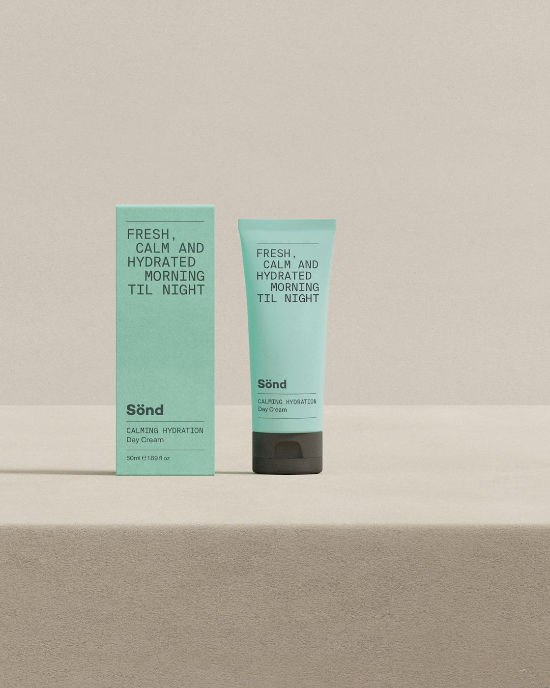
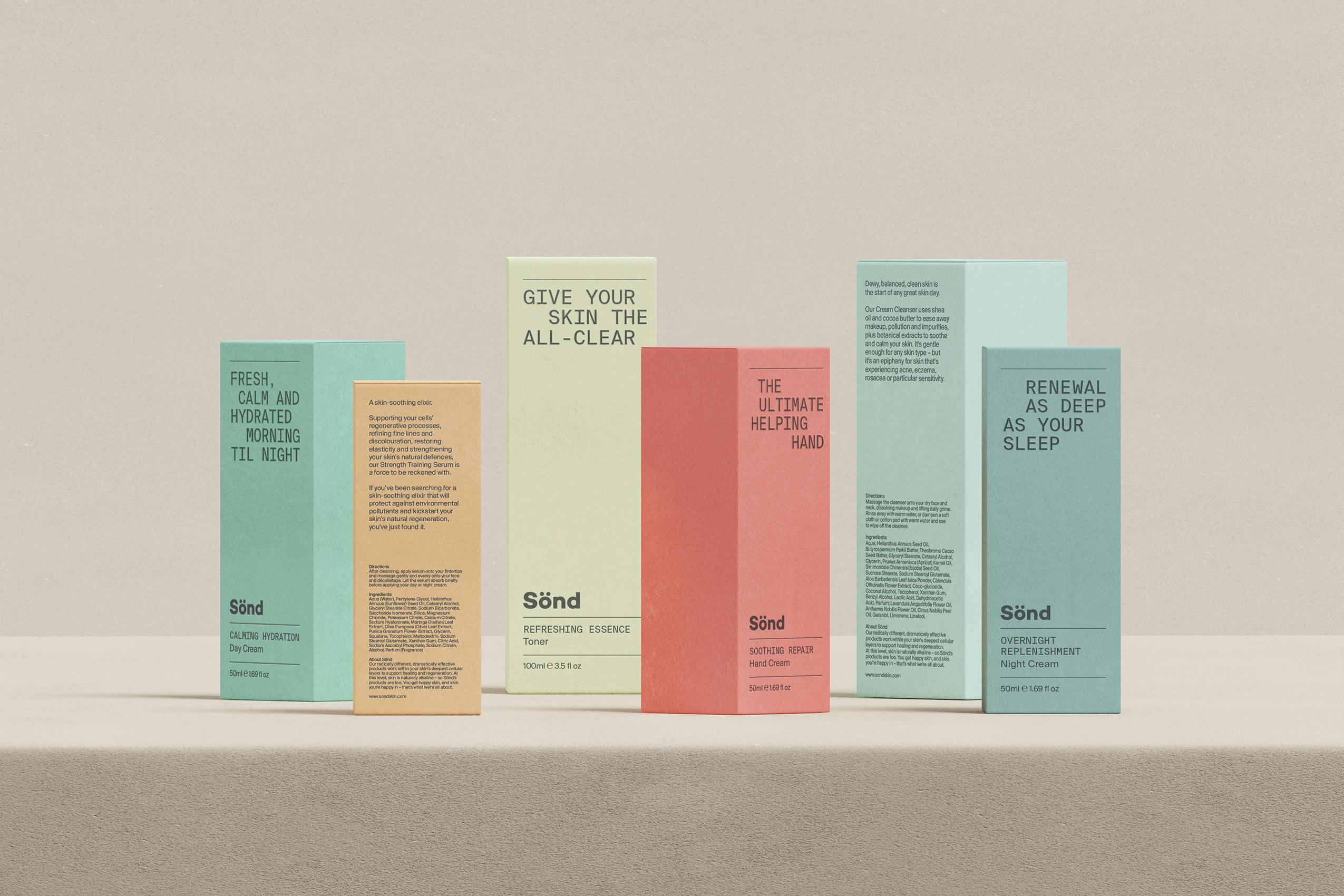
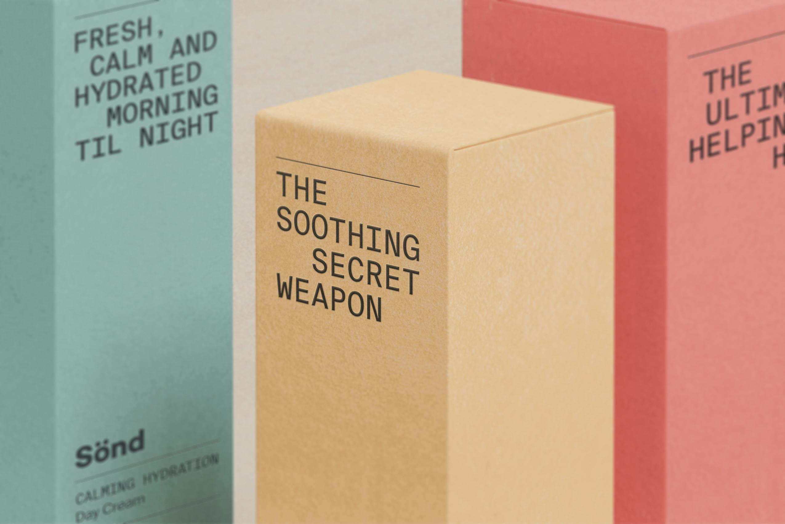
Premium skincare is a densely populated market where product packaging adds significant value to the customer’s experience.
After a strategic review of Sönd’s business, we determined that they needed to align the look of their packaging with their core brand vision, whilst retaining their current character and brand awareness.
Using their existing logotype, we evolved their design to refresh it. We developed a revised colour hierarchy across 15 products in three ranges. We also elevated distinct messaging about each product’s skincare purpose within the pack design.
What started out as a packaging redesign brief, evolved into a more comprehensive appraisal of Sönd’s visual communications. This has ultimately led them to a more sophisticated, elegant and standout identity throughout their branding.