


Client
Des Bains
What we did
- Brand strategy
- Brand identity
- Art direction
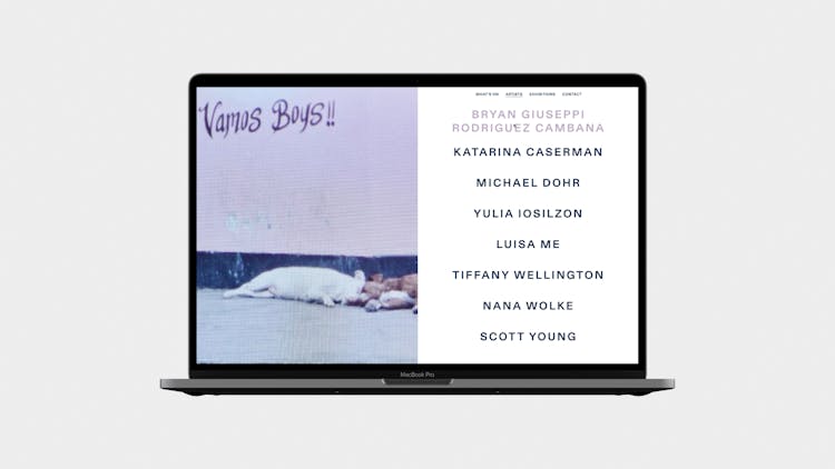
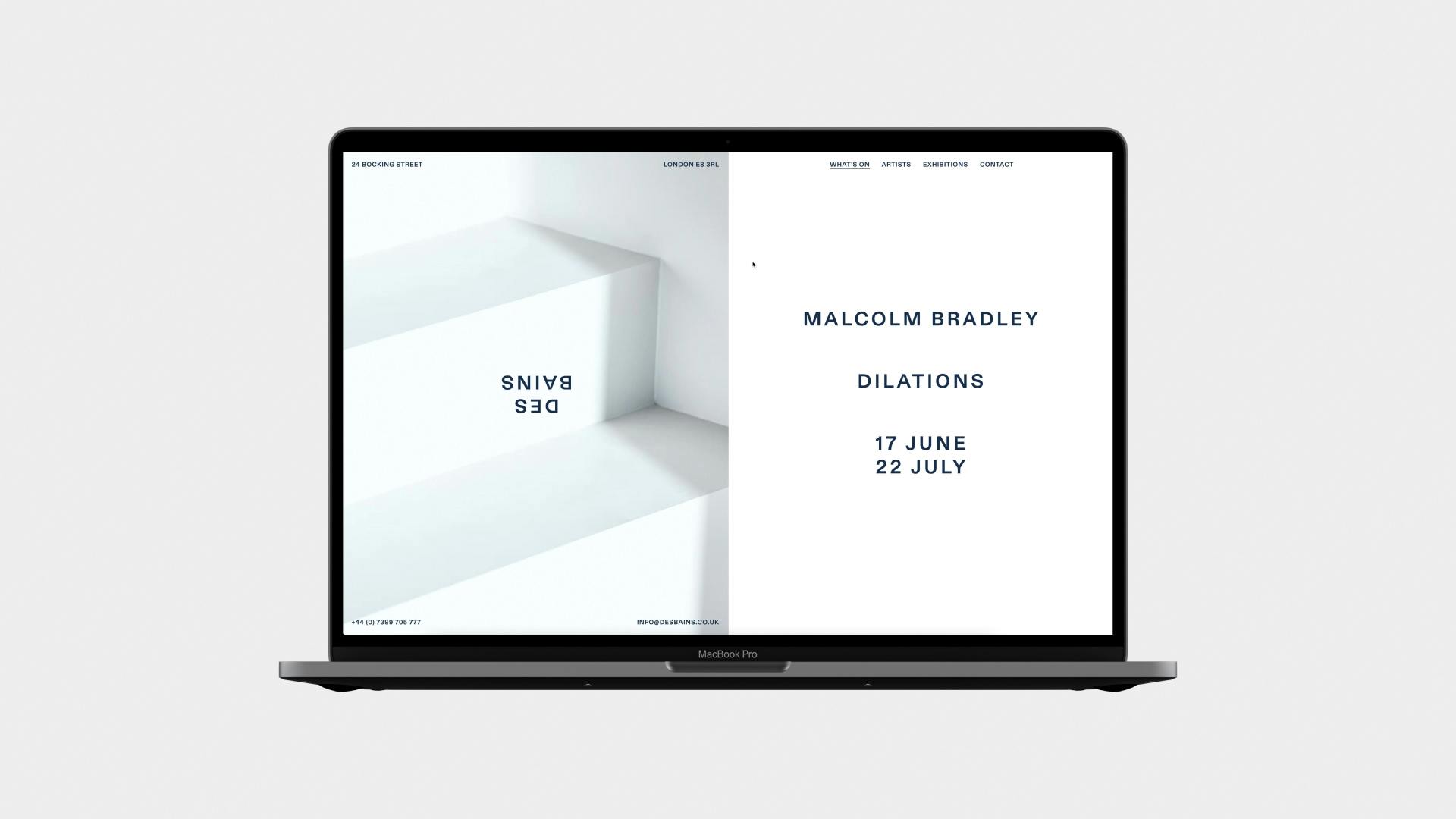
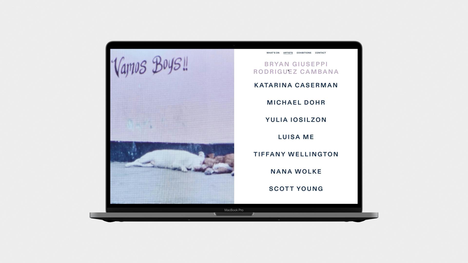
- Website design & development
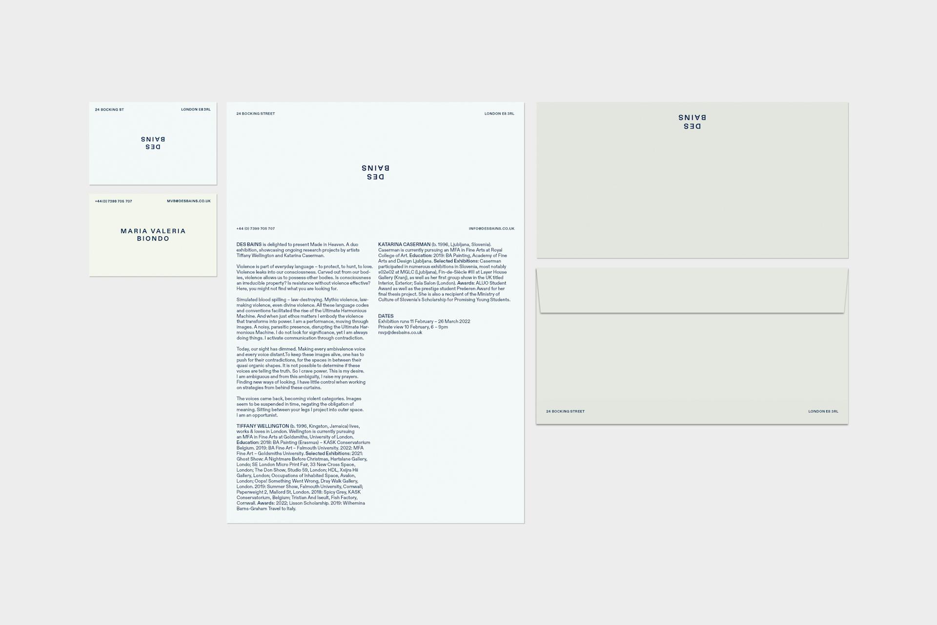
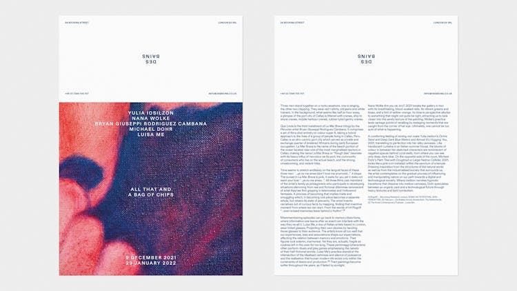
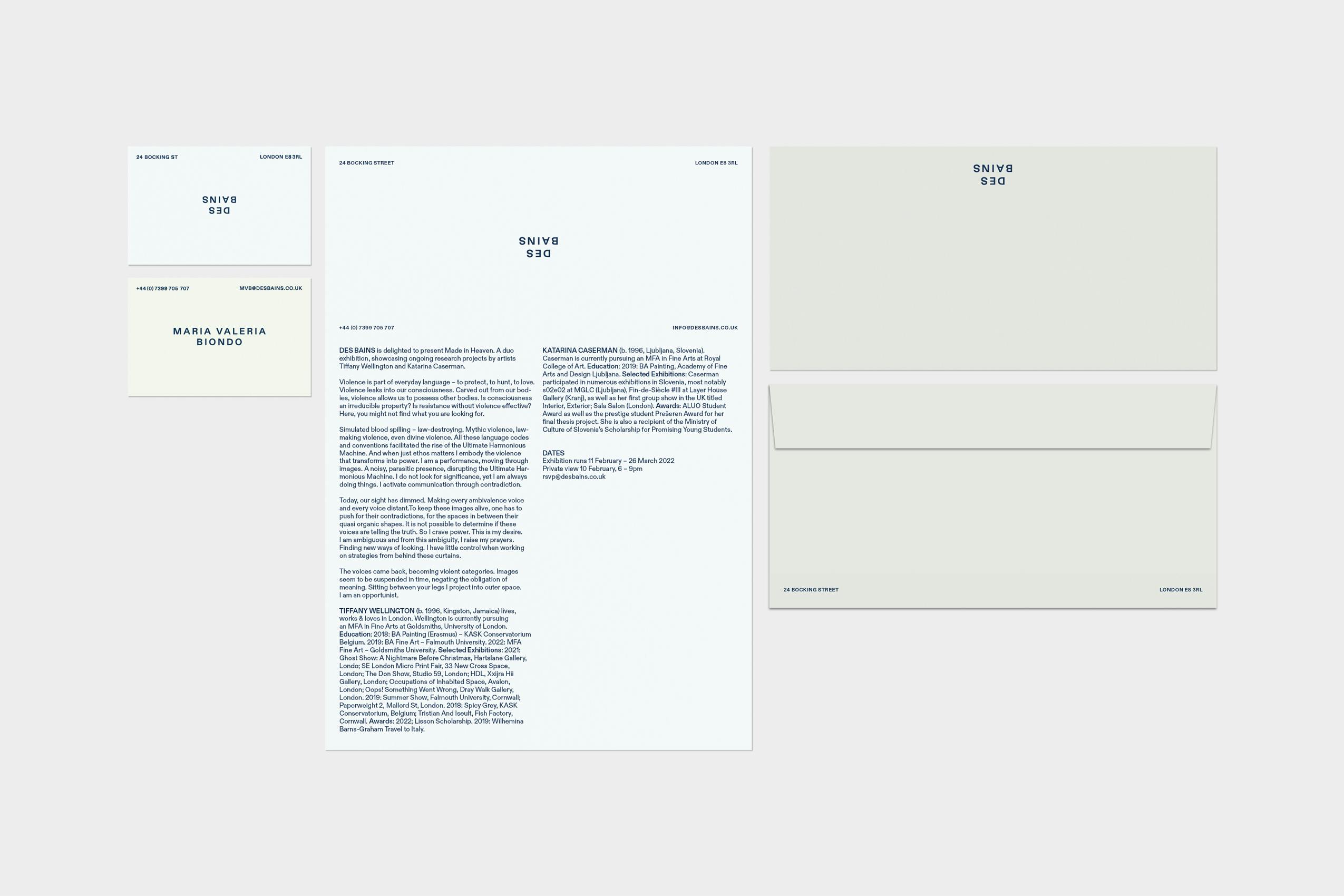
- Stationery
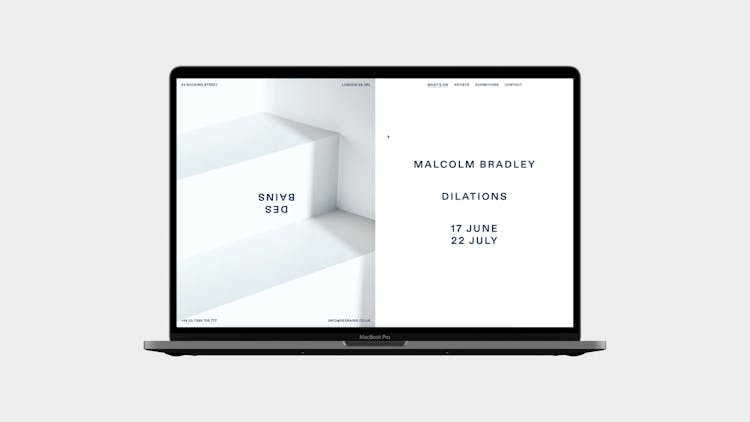
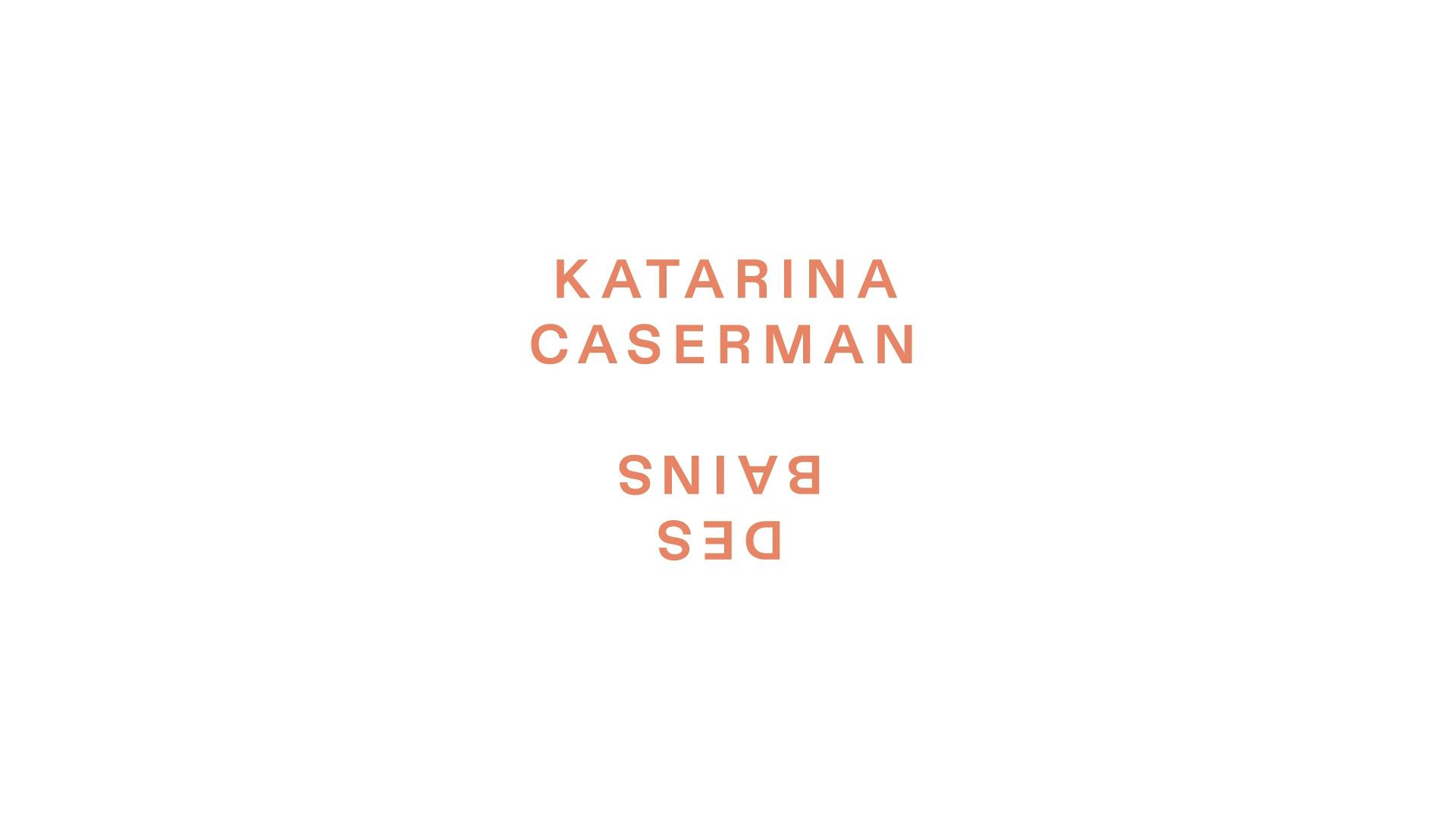
Opening a fine art gallery in East London, the directors of Des Bains sought a distinctive identity to position their innovative programme. Part commercial gallery, part research platform-event space, Des Bains’ is not your typical East London setup. Our identity design aimed to position the gallery by leveraging that distinctive point of difference, whilst expressing the edgy character of its artist roster.
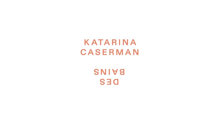
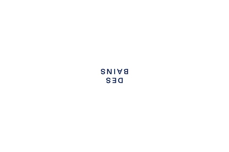
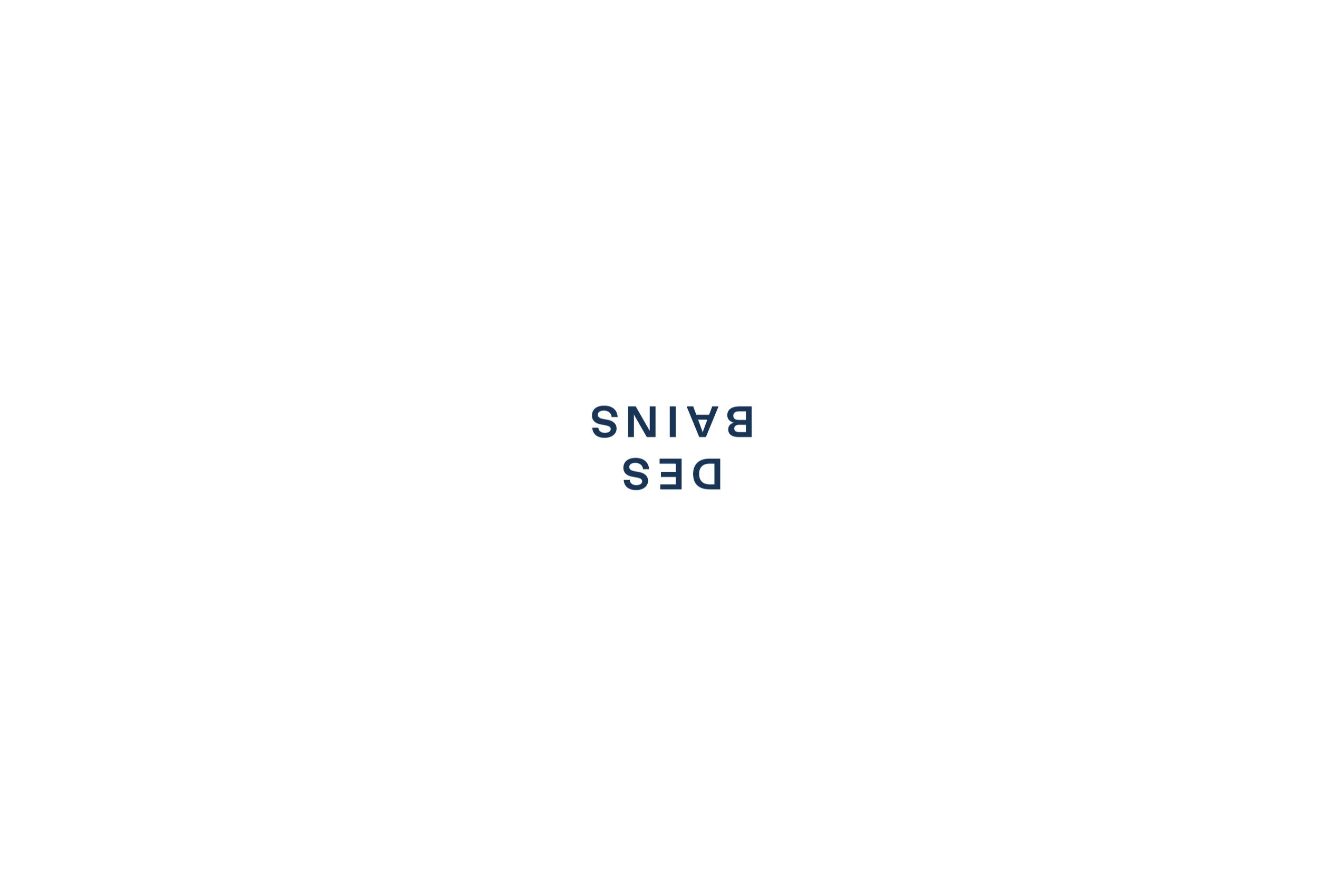
We created a classical, yet robust logotype. Openly spaced sans serif type, stacked and centred, set an elegant, quasi-institutional tone. Then, we flipped it 180 degrees – a simple move that discharges a disproportionate subversive effect. Upended, the logotype begins to behave more spatially. We pushed this in our approach to the website design, exploring how inversion and division can be used to highlight the aspect of encounter between the gallery, its artists, and visitors.
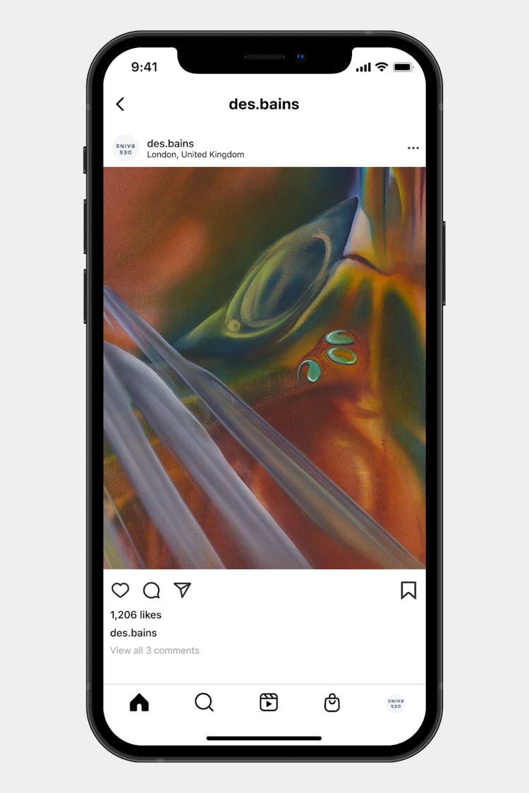
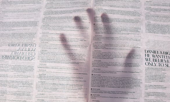
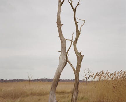
An emphasis on the spatial carried over into our photographic art direction. Suggestive glimpses of the physical gallery space and close-cropped macro views of works combine with less unexpected documentation shots and installation views.